Create a scatter plot in Python with Seaborn
Back to snippetsimport modules
import pandas as pd
import numpy as np
%matplotlib inline
import seaborn as sns
create dummy dataframe
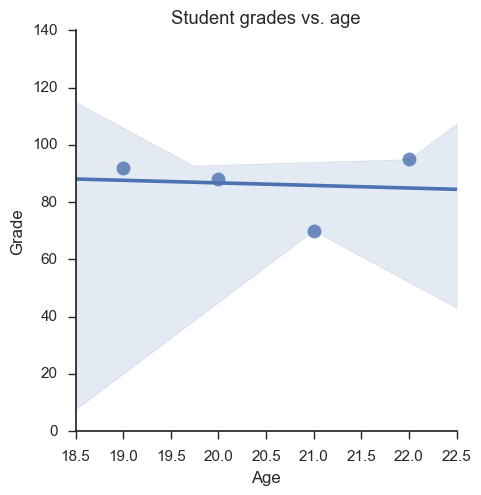
raw_data = {'name': ['Willard Morris', 'Al Jennings', 'Omar Mullins', 'Spencer McDaniel'],
'age': [20, 19, 22, 21],
'favorite_color': ['blue', 'blue', 'yellow', "green"],
'grade': [88, 92, 95, 70]}
df = pd.DataFrame(raw_data, index = ['Willard Morris', 'Al Jennings', 'Omar Mullins', 'Spencer McDaniel'])
df
| age | favorite_color | grade | name | |
|---|---|---|---|---|
| Willard Morris | 20 | blue | 88 | Willard Morris |
| Al Jennings | 19 | blue | 92 | Al Jennings |
| Omar Mullins | 22 | yellow | 95 | Omar Mullins |
| Spencer McDaniel | 21 | green | 70 | Spencer McDaniel |
generate a scatter plot using seaborn
# Set style of scatterplot
sns.set_context("notebook", font_scale=1.1)
sns.set_style("ticks")

# Create scatterplot of dataframe
sns.lmplot('age', # Select df column name for horizontal axis element
'grade', # Select df column name for vertical axis element
df, # Select data source
fit_reg = True, # Fix a regression line
scatter_kws={"s": 100}) # S marker size

# Set title
plt.title('Student grades vs. age')

# Set x-axis label
plt.xlabel('Age')

# Set y-axis label
plt.ylabel('Grade')

#complete docs: https://seaborn.pydata.org/generated/seaborn.lmplot.html#seaborn.lmplot