Create a bar chart in Python with Matplotlib
Back to snippetsimport modules
import pandas as pd
import numpy as np
%matplotlib inline
import matplotlib.pyplot as plt
create dummy dataframe
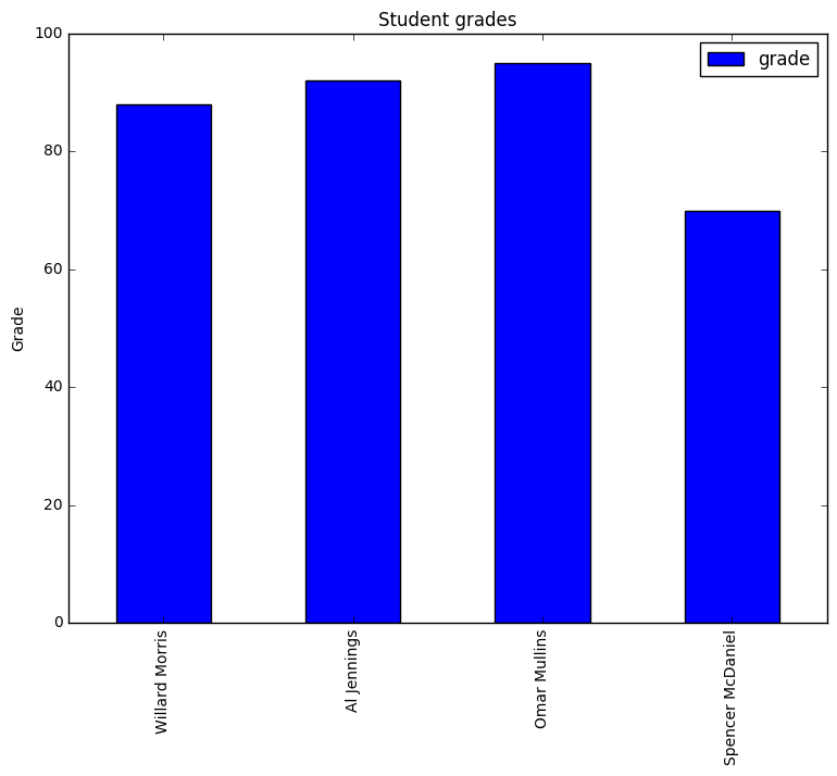
raw_data = {'name': ['Willard Morris', 'Al Jennings', 'Omar Mullins', 'Spencer McDaniel'],
'age': [20, 19, 22, 21],
'favorite_color': ['blue', 'blue', 'yellow', "green"],
'grade': [88, 92, 95, 70]}
df = pd.DataFrame(raw_data, index = ['Willard Morris', 'Al Jennings', 'Omar Mullins', 'Spencer McDaniel'])
df
| age | favorite_color | grade | name | |
|---|---|---|---|---|
| Willard Morris | 20 | blue | 88 | Willard Morris |
| Al Jennings | 19 | blue | 92 | Al Jennings |
| Omar Mullins | 22 | yellow | 95 | Omar Mullins |
| Spencer McDaniel | 21 | green | 70 | Spencer McDaniel |
generate a bar plot using matplotlib
#filter the dataframe on student grades, so we can plot that variable
df = df[['grade']]
#set up the plot
my_plot = df.plot(kind='bar',title="Student grades",figsize=(9, 7))
my_plot.set_ylabel('Grade')
<matplotlib.text.Text at 0x10ca91ba8>