Correlating Stock Returns Using Python
Learn how to pull stock price data with Python and analyze correlations between different companies' stock returns using a Seaborn heatmap.
In this tutorial I'll walk you through a simple methodology to correlate various stocks against each other. We'll grab the prices of the selected stocks using python, drop them into a clean dataframe, run a correlation, and visualize our results.
(1) Import libraries, select our list of stocks to correlate
 import numpy as np
 import pandas as pd
 #used to grab the stock prices, with yahoo
 import pandas_datareader as web
 from datetime import datetime
 #to visualize the results
 import matplotlib.pyplot as plt
 import seaborn

 #select start date for correlation window as well as list of tickers
 start = datetime(2017, 1, 1)
 symbols_list = ['AAPL', 'F', 'TWTR', 'FB', 'AAL', 'AMZN', 'GOOGL', 'GE']
(2) Pull stock prices, push into clean dataframe
#array to store prices
symbols=[]

#pull price using iex for each symbol in list defined above
for ticker in symbols_list:
    r = web.DataReader(ticker, 'yahoo', start)
    # add a symbol column
    r['Symbol'] = ticker
    symbols.append(r)

# concatenate into df
df = pd.concat(symbols)
df = df.reset_index()
df = df[['Date', 'Close', 'Symbol']]
df.head()
We're now left with a table in this format:
| date | close | symbol |
|---|---|---|
| 2017-01-03 | 113.4101 | AAPL |
| 2017-01-04 | 113.2832 | AAPL |
| 2017-01-05 | 113.8593 | AAPL |
3) However, we want our symbols represented as columns so we'll have to pivot the dataframe:
 df_pivot = df.pivot('date','symbol','close').reset_index()
 df_pivot.head()
| date | AAL | AAPL | AMZN | F | FB | GE | GOOGL | TWTR | |
|---|---|---|---|---|---|---|---|---|---|
| 0 | 2017-01-03 | 45.7092 | 113.4101 | 753.67 | 11.4841 | 116.86 | 30.1370 | 808.01 | 16.44 |
| 1 | 2017-01-04 | 46.1041 | 113.2832 | 757.18 | 12.0132 | 118.69 | 30.1465 | 807.77 | 16.86 |
| 2 | 2017-01-05 | 45.3044 | 113.8593 | 780.45 | 11.6483 | 120.67 | 29.9754 | 813.02 | 17.09 |
| 3 | 2017-01-06 | 45.6203 | 115.1286 | 795.99 | 11.6392 | 123.41 | 30.0610 | 825.21 | 17.17 |
| 4 | 2017-01-09 | 46.4792 | 116.1832 | 796.92 | 11.5206 | 124.90 | 29.9183 | 827.18 | 17.50 |
(4) Next, we can run the correlation. Using the Pandas 'corr' function to compute the Pearson correlation coeffecient between each pair of equities
 corr_df = df_pivot.corr(method='pearson')
 #reset symbol as index (rather than 0-X)
 corr_df.head().reset_index()
 del corr_df.index.name
 corr_df.head(10)
| symbol | AAL | AAPL | AMZN | F | FB | GE | GOOGL | TWTR |
|---|---|---|---|---|---|---|---|---|
| AAL | 1.000000 | 0.235239 | 0.226061 | 0.068024 | 0.356063 | -0.332681 | 0.494075 | 0.169487 |
| AAPL | 0.235239 | 1.000000 | 0.868763 | 0.184501 | 0.911380 | -0.895210 | 0.903191 | 0.781755 |
| AMZN | 0.226061 | 0.868763 | 1.000000 | 0.108351 | 0.744732 | -0.937415 | 0.864455 | 0.955373 |
| F | 0.068024 | 0.184501 | 0.108351 | 1.000000 | 0.206055 | -0.216064 | 0.189753 | 0.161078 |
| FB | 0.356063 | 0.911380 | 0.744732 | 0.206055 | 1.000000 | -0.814703 | 0.900033 | 0.650404 |
| GE | -0.332681 | -0.895210 | -0.937415 | -0.216064 | -0.814703 | 1.000000 | -0.882526 | -0.866871 |
| GOOGL | 0.494075 | 0.903191 | 0.864455 | 0.189753 | 0.900033 | -0.882526 | 1.000000 | 0.789379 |
| TWTR | 0.169487 | 0.781755 | 0.955373 | 0.161078 | 0.650404 | -0.866871 | 0.789379 | 1.000000 |
5) Finally, we can plot a heatmap of the correlations (with Seaborn and Matplotlib) to better visualize the results:
 #take the bottom triangle since it repeats itself
 mask = np.zeros_like(corr_df)
 mask[np.triu_indices_from(mask)] = True
 #generate plot
 seaborn.heatmap(corr_df, cmap='RdYlGn', vmax=1.0, vmin=-1.0 , mask = mask, linewidths=2.5)
 plt.yticks(rotation=0)
 plt.xticks(rotation=90)
 plt.show()
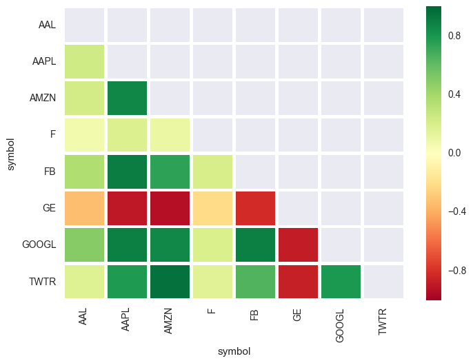
Here we can see that, as expected, the tech companies are generally pretty highly correlated (as indicated by dark green -- AMZN/GOOGL, FB/AAPL, etc). Conversely, Ford (F) and General Electric (GE) are either not correlated or negatively correlated with the rest of the group.