Which news publications have the most positive headlines? (simple sentiment analysis with Textblob)
Analyzing hundreds of thousands of news headlines with Textblob to determine which publications are the most positive.
Inspiration/base dataset
Kaggle provides a great dataset containing news headlines for most major publications. I decided to run some simple sentiment analysis using Textblob, a Python library for processing textual data, that comes with some pre-trained sentiment classifiers. One could of course train their own model, and probably obtain more accurate results overall, but I wasn't able to quickly fine a clean dataset of news headlines tagged with sentiment. Textblob should work fine for comparing the publications relative to each other.
To start, from Kaggle we're given a table as follows:
| author | content | date | month | publication | title | url | year | |
|---|---|---|---|---|---|---|---|---|
| 0 | Avi Selk | Uber driver Keith Avila picked up a p... | 2016-12-30 | 12.0 | Washington Post | An eavesdropping Uber driver saved his 16-year... | https://web.archive.org/web/20161231004909/htt... | 2016.0 |
| 1 | Sarah Larimer | Crews on Friday continued to search L... | 2016-12-30 | 12.0 | Washington Post | Plane carrying six people returning from a Cav... | https://web.archive.org/web/20161231004909/htt... | 2016.0 |
| 2 | Renae Merle | When the Obama administration announced a... | 2016-12-30 | 12.0 | Washington Post | After helping a fraction of homeowners expecte... | https://web.archive.org/web/20161231004909/htt... | 2016.0 |
| 3 | Chelsea Harvey | This story has been updated. A new law in... | 2016-12-30 | 12.0 | Washington Post | Yes, this is real: Michigan just banned bannin... | https://web.archive.org/web/20161231004909/htt... | 2016.0 |
| 4 | Christopher Ingraham | The nation’s first recreational marijuana... | 2016-12-29 | 12.0 | Washington Post | What happened in Washington state after voters... | https://web.archive.org/web/20161231004909/htt... | 2016.0 |
After poking around the n-counts by year, it looks like 2016-2017 are the only years with decent data >~2000 headlines across each publication. So, I filtered the dataset to these two years:
#years came in string.0 format, just filtering them as they are for now
years = ['2016.0','2017.0']
df = df.loc[df['year'].isin(years)]
Running our data through Textblob to determine news headline sentiment
Great, so now we have a pretty clean dataframe containing headlines by news publication. Next, I'll create a utility function to log the polarity (ranging from -1 as most negative to 1 as most positive) of each headline
#used to analyze sentiment w/ textblob, leaving the raw output
def analize_sentiment_raw(headline):
    '''
    Function to lassify the polarity of a tweet
    using textblob.
    '''
    analysis = TextBlob(headline)
    #polarity = negative (-1) to positive (1)
    return analysis.sentiment.polarity
Next, we'll just feed the headlines into the function we created above:
df['SA'] = np.array([ analize_sentiment_raw(headline) for headline in df['title']])
We can now see the polarity score (again ranging from -1 to 1) reflected in our dataframe:
| title | publication | author | date | year | month | url | content | SA | publish_year | |
|---|---|---|---|---|---|---|---|---|---|---|
| 0 | An eavesdropping Uber driver saved his 16-year... | Washington Post | Avi Selk | 2016-12-30 | 2016.0 | 12.0 | https://web.archive.org/web/20161231004909/htt... | Uber driver Keith Avila picked up a p... | 0.00 | 2016 |
| 1 | Plane carrying six people returning from a Cav... | Washington Post | Sarah Larimer | 2016-12-30 | 2016.0 | 12.0 | https://web.archive.org/web/20161231004909/htt... | Crews on Friday continued to search L... | -0.40 | 2016 |
| 2 | After helping a fraction of homeowners expecte... | Washington Post | Renae Merle | 2016-12-30 | 2016.0 | 12.0 | https://web.archive.org/web/20161231004909/htt... | When the Obama administration announced a... | -0.05 | 2016 |
| 3 | Yes, this is real: Michigan just banned bannin... | Washington Post | Chelsea Harvey | 2016-12-30 | 2016.0 | 12.0 | https://web.archive.org/web/20161231004909/htt... | This story has been updated. A new law in... | 0.20 | 2016 |
| 4 | What happened in Washington state after voters... | Washington Post | Christopher Ingraham | 2016-12-29 | 2016.0 | 12.0 | https://web.archive.org/web/20161231004909/htt... | The nation’s first recreational marijuana... | 0.00 | 2016 |
Pivoting the data to rank news publications by headline sentiment
Now that we have sentiment attached to each news headline as reflected in col 'SA' above, we can pivot to summarize the publications with the most positive/negative headlines:
#grab a slice of the original df with just publication and polarity score
df_clean = df[['SA', 'publication']]
#pivoting to grab the average sentiment by publication
df_clean2 = df_clean.groupby(['publication']).mean().reset_index()
#preview the dataframe, sorting by most positive
df_clean2.sort_values(['SA'],ascending=False).head(15)
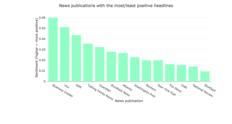
Below, we can see that (according to Textblob's pre-trained classifier) Business Insider has the most positive headlines on average, with Breitbart coming in at the bottom with the most negative headlines.
| publication | SA | |
|---|---|---|
| 2 | Business Insider | 0.060214 |
| 12 | Vox | 0.051213 |
| 7 | NPR | 0.043666 |
| 11 | Talking Points Memo | 0.035564 |
| 6 | Guardian | 0.032476 |
| 3 | Buzzfeed News | 0.028023 |
| 0 | Atlantic | 0.026798 |
| 13 | Washington Post | 0.022752 |
| 10 | Reuters | 0.020006 |
| 9 | New York Post | 0.019992 |
| 5 | Fox News | 0.016228 |
| 4 | CNN | 0.015503 |
| 8 | National Review | 0.014110 |
| 1 | Breitbart | 0.009544 |
Next, lets check out the n-counts on these, and add a view that shows the % of articles that are positive (score >0), negative (score 0, 1, 0)
df_clean['neutral'] = np.where(df['SA'] == 0, 1, 0)
df_clean['negative'] = np.where(df['SA'] < 0, 1, 0)
df_clean2 = df_clean[['publication','positive','neutral','negative']]
df_clean3 = df_clean2.groupby(['publication']).sum().reset_index()
df_clean3.sort_values(['positive'],ascending=False).head(15)
| publication | positive | neutral | negative | |
|---|---|---|---|---|
| 0 | Atlantic | 1435 | 4781 | 963 |
| 1 | Breitbart | 5469 | 13536 | 4701 |
| 2 | Business Insider | 2585 | 2852 | 1320 |
| 3 | Buzzfeed News | 1354 | 2549 | 951 |
| 4 | CNN | 1591 | 5056 | 1279 |
| 5 | Fox News | 990 | 2493 | 839 |
| 6 | Guardian | 2366 | 4558 | 1700 |
| 7 | NPR | 3451 | 6359 | 2010 |
| 8 | National Review | 1203 | 4064 | 904 |
| 9 | New York Post | 4677 | 9196 | 3573 |
| 10 | Reuters | 2423 | 6600 | 1664 |
| 11 | Talking Points Memo | 670 | 1499 | 393 |
| 12 | Vox | 1730 | 2134 | 1014 |
| 13 | Washington Post | 3175 | 5555 | 2348 |
Great, we can now see the # of headlines Textblob identified as positive/neutral/negative. Lets add some %s into this df too:
#fields for positive/neutral/negative percents
df_clean3['positive_perc'] = \
df_clean3['positive']/(df_clean3['positive']+df_clean3['neutral']+df_clean3['negative'])
df_clean3['neutral_perc'] = \
df_clean3['neutral']/(df_clean3['positive']+df_clean3['neutral']+df_clean3['negative'])
df_clean3['negative_perc'] = \
df_clean3['negative']/(df_clean3['positive']+df_clean3['neutral']+df_clean3['negative'])
#sort and preview dataframe
df_clean3.sort_values(['positive_perc'],ascending=False).head(15)
| publication | positive | neutral | negative | positive_perc | neutral_perc | negative_perc | |
|---|---|---|---|---|---|---|---|
| 2 | Business Insider | 2585 | 2852 | 1320 | 0.382566 | 0.422081 | 0.195353 |
| 12 | Vox | 1730 | 2134 | 1014 | 0.354654 | 0.437474 | 0.207872 |
| 7 | NPR | 3451 | 6359 | 2010 | 0.291963 | 0.537986 | 0.170051 |
| 13 | Washington Post | 3175 | 5555 | 2348 | 0.286604 | 0.501444 | 0.211952 |
| 3 | Buzzfeed News | 1354 | 2549 | 951 | 0.278945 | 0.525134 | 0.195921 |
| 6 | Guardian | 2366 | 4558 | 1700 | 0.274351 | 0.528525 | 0.197124 |
| 9 | New York Post | 4677 | 9196 | 3573 | 0.268084 | 0.527112 | 0.204803 |
| 11 | Talking Points Memo | 670 | 1499 | 393 | 0.261514 | 0.585090 | 0.153396 |
| 1 | Breitbart | 5469 | 13536 | 4701 | 0.230701 | 0.570995 | 0.198304 |
| 5 | Fox News | 990 | 2493 | 839 | 0.229061 | 0.576816 | 0.194123 |
| 10 | Reuters | 2423 | 6600 | 1664 | 0.226724 | 0.617573 | 0.155703 |
| 4 | CNN | 1591 | 5056 | 1279 | 0.200732 | 0.637901 | 0.161368 |
| 0 | Atlantic | 1435 | 4781 | 963 | 0.199889 | 0.665970 | 0.134141 |
| 8 | National Review | 1203 | 4064 | 904 | 0.194944 | 0.658564 | 0.146492 |
Visualizing news publication sentiment
Using plotly, making a quick bar chart to visualize the news publication sentiment shown in our pivoted data above:
#bar chart
x = df_clean2['publication']
y = df_clean2['SA']

data = [
    go.Bar(
        x=x,
        y=y,
        marker=dict(
            color='#8bffc0f2',
            line=dict(
                color='#d8ffea96',
                width=1.5
            ),
        ),
        opacity=1
    )
]
layout = go.Layout(
      title='News publications with the most/least positive headlines',
    xaxis=dict(
        title='News publication'
    ),
    yaxis=dict(
        title='Sentiment (higher = more positive',
    ),
    margin=go.Margin(
        l=140,
        r=90,
        b=140,
        t=60,
        pad=4
    ),
)
fig = go.Figure(data=data, layout=layout)
py.iplot(fig, filename='news_pub_sentiment')
Voila! We were able to quickly use Textblob to classify and rank sentiment across hundreds of thousands of news headlines.
 For those interested, the jupyter notebook with the complete code can be found in our github repository.